Brinker
Client
Brinker
Discipline
Premium Joinery
Services
Brand Identity
Brand Positioning
Brand Curation
Tone Of Voice
Visual Identity
Brinker is a specialist joinery consultancy shaping finely resolved environments across hospitality, workplace and lifestyle sectors, from luxury hotels and premium commercial spaces to high-end retail and residential interiors.
We were engaged to define a positioning and identity that expressed Brinker’s intrinsic design intelligence. Their distinction lies in an uncompromising attention to detail, where craft, coordination and construction converge. Every project is approached as a considered composition, guided by collaboration, material understanding and a disciplined execution that ensures continuity from concept to completion.
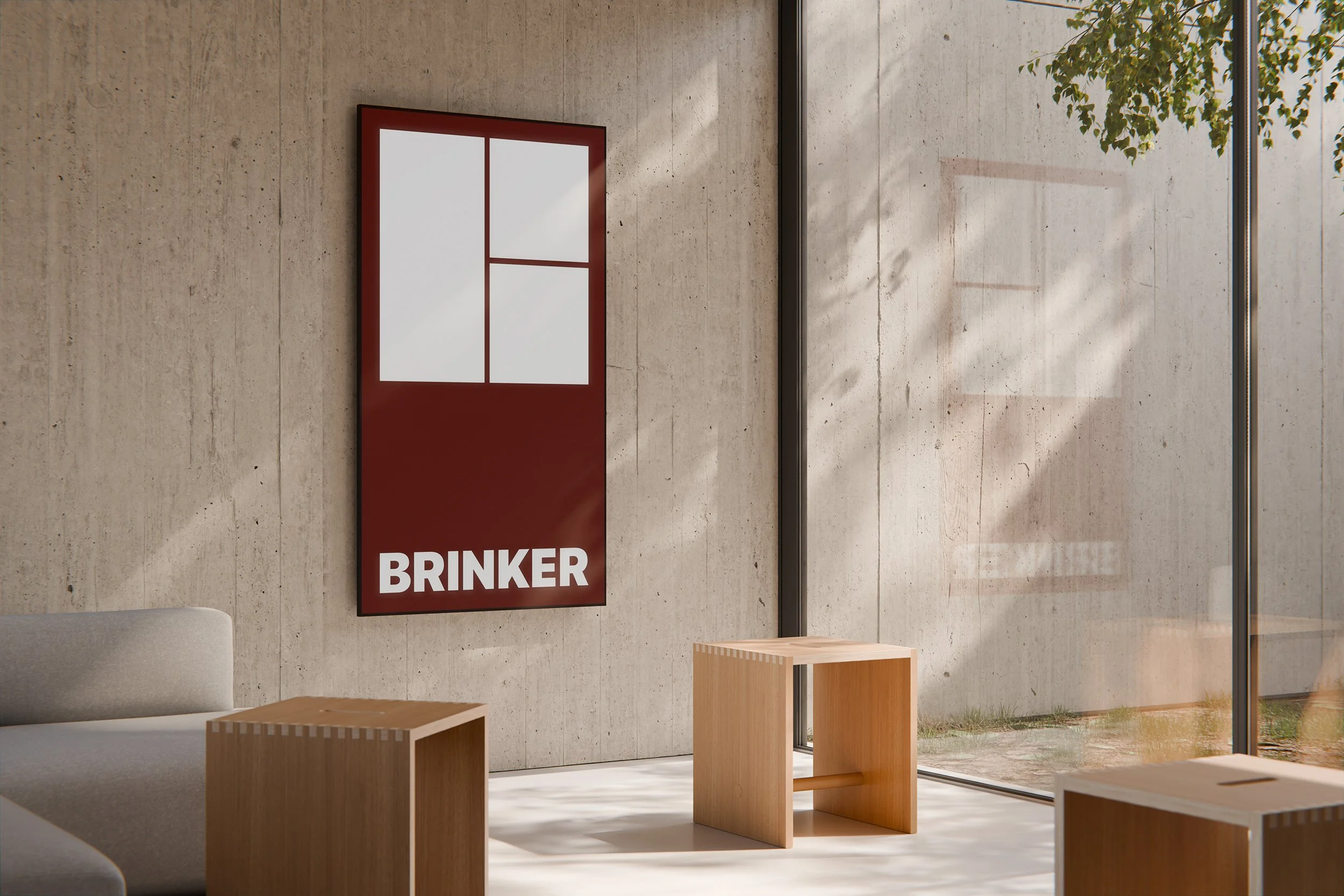
The brand identity is anchored in purpose, precision and partnership, expressed through a rigorous grid framework. This system becomes both metaphor and method: a visual language of alignment, proportion and control. The grid reflects the spatial logic of joinery itself, measured, resolved and exacting. It speaks to a design culture where clarity of structure enables refinement of form.
From this framework emerges a reductive “B” logomark, constructed with architectural restraint. Its geometry is deliberate and balanced, with every line and junction considered. The result is not decorative, but distilled — a mark that communicates confidence through reduction. The grid operates as more than aesthetic device; it becomes a declaration of discipline, craftsmanship and structural intelligence. The identity system as a whole is restrained yet assured, a reflection of Brinker’s belief that exceptional design is not about embellishment, but about precision, proportion and the quiet confidence of things made properly.