Youth Outreach
There’s no place like home
Behind the beautiful beaches and glitzy glamour, the Gold Coast’s dark side of increasing homelessness for youths aged 15-25 is growing everyday. Youth Outreach (formally Gold Coast Project for Homeless Youth Inc) is a community organisation formed to provide accommodation, support and transition for homeless young people in the Gold Coast local area.
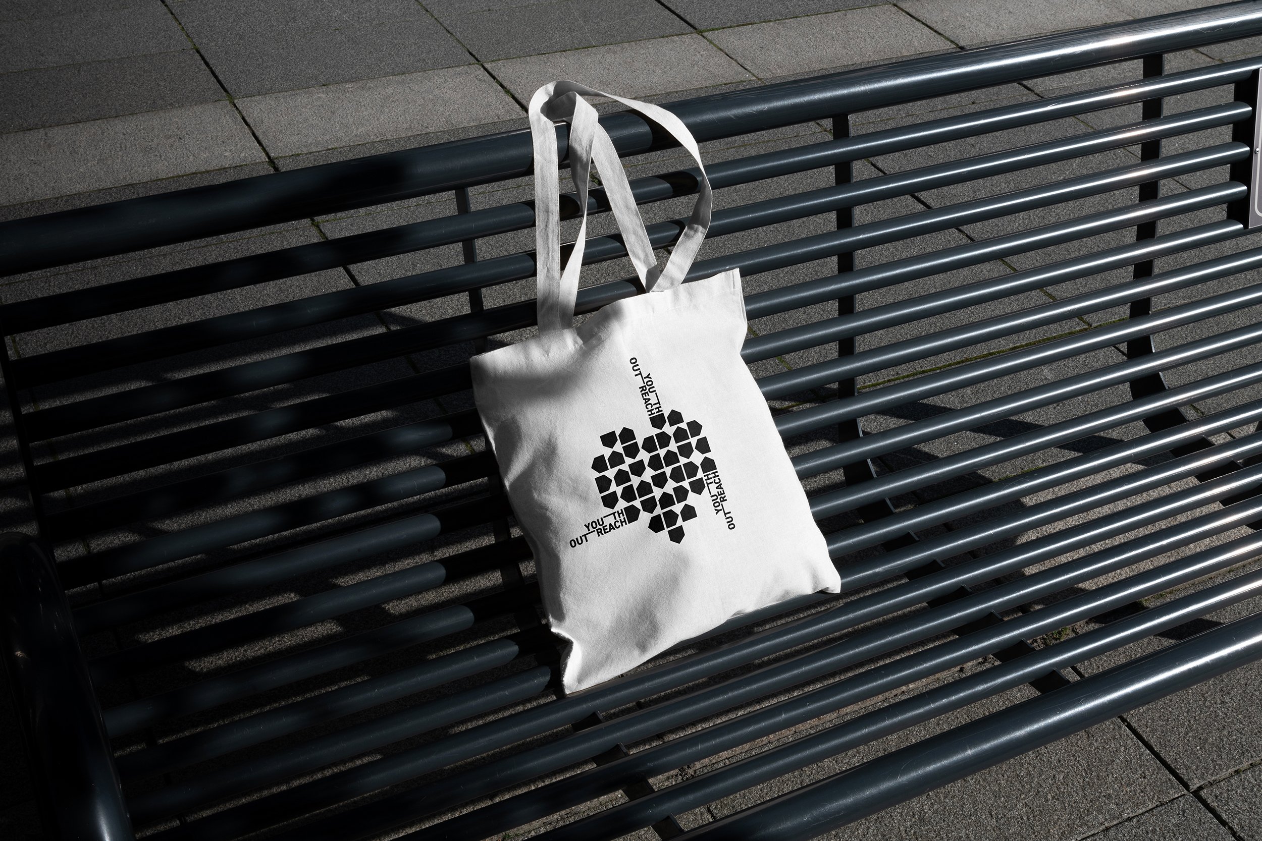
As NFP organisation, Youth Outreach relies on government support and the local community. The team approached The Initiative to undertake a rebranding exercise with a goal to help raise awareness for their mission. Inspired by the local sun and surf culture, the illustrative concept symbolises the diversity of the youth collective, and the highs and lows of each individual’s story, coupled with a vivid and courageous colour palette that commands attention.
The brand system for Youth Outreach is informed by the narrative of one path doesn’t determine your direction.
Four house shapes come together to create an endless pattern symbolising the ups, downs and sideway steps of homelessness. These marks represent and reinforce to the young people that your past doesn’t represent your future. Just like the young people experiencing homelessness, the house shapes form a multi-use grid system that guides and informs layouts and allows the identity to flex into a range of outcomes as the brand grows.
A coffee cart initiative was also created by Youth Outreach in collaboration with a hospitality school to help the youths learn the service and hospitality business whilst making money to support their future.
Scope
Branding Strategy
Naming
Brand Identity
Creative Direction
Social Media
Publication Design
Annual Report
Website Design
Website Development


